A Note from the Master Calligrapher

By SAMIR SAYEGH
(Translated from Arabic by MONA BARAKAT)
Language becomes form when the pulses of the heart increase and the imagination widens; when ideas multiply and collide; when the hand precedes the tongue and the eye the view; when the body stands and the soul awakens, and when vision expands. Form becomes content when the eyes of a viewer regard and contemplate it.
The world of forms is the language that calligraphy materialises in order to facilitate human communication. To appreciate the aesthetics of calligraphy, we must learn to read this language and decipher its letters. What are these letters and how should they be read? They should be read in their nakedness and their clearness, in their straight and cursive lines, in the vertical and horizontal, in the long and the short, the thick and the thin, the sharp and the soft, the attached and the detached, the closed and the open, the ascending and the descending, the recumbent and the flat.
The Kufic script of early Qur’ans offers a fabulous example of the evolution, maturity and depth of this new language — the language of forms and their capacity to express and communicate. The course of the aleph [or alef or alif, the first letter of the Semitic abjads, including Phoenician ‘Ālep, Hebrew ‘Ālef, Aramaic Ālap, Syriac ʾĀlap̄, and Arabic Alif — ed.] through their pages unveils the varied possibilities latent in the straight line, particularly when the straightness deviates from its initial course to bend a little, grows toward an inclined position, or seeks to balance inclination and straightness. With a little imagination, this aleph starts to move, dance, and even speak. Meanings thus proliferate to the limit of what the eye can read in the language of forms and letters. No wonder aleph becomes rain falling, a mare preparing to jump, a branch bending under its fruits, a razor-sharp sword. And no wonder that aleph can exemplify a fresh straightness, unique individuality, distinguished inclination, absolute standing, sudden upturn, deep meditation or overflowing plenitude.
Ornamentation is one of the core attributes of Islamic art. It encapsulates in its diverse manifestations the characteristics of this art and its aesthetic philosophy. It does not reproduce nature in its apparent forms, nor does it aim to do that. Rather, it has always aspired to replicate nature’s hidden system, the system of growth, maturity, reproduction and similitude. From the beginning it united with geometry as an absolute system and encompassed geometry’s strict and precise logic to replicate a nuclear module based on structures of proportionality, juxtaposition, intersection, junction, apposition and rotation. As such, ornamentation illuminates the uniqueness of the underlying hidden system, linking human beings and nature and testifying that truth is one in its different manifestations.
The indivisible unit in ornamentation replicates or reproduces itself by means of mathematical systems to create a geometrical grid or ornamental work. If this unit is the part, then the grid or ornamental work is the whole. As we contemplate the relation between the part and the whole, it becomes clear that the part conveys in its essence the image of the whole, and the whole necessarily carries the image of the part. From there comes the expression of the small universe that embraces the large universe. Yet ornamentation has faced — and still faces — a negative reception. It could well be that Western artistic values have impeded a deep understanding of the aesthetics of ornamentation.

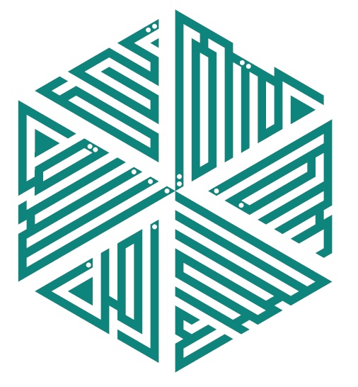
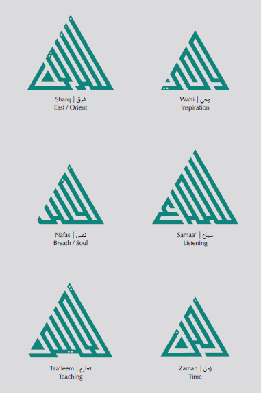
I have tried to unite calligraphy and ornamentation, making calligraphy itself ornamentation by turning the unit or nucleus into a letter or word — a calligraphic unit. At the same time, I seek to turn repetition into reproduction, as an absolute rather than a pattern or style, such that its renewal is always surprising.
That the quadrangular Kufic script was able to organise letters and words into a matrix based on the intersection of vertical and horizontal lines over right angles represents a great cultural achievement. Kufic script is the apex of geometric purity, or what we call pure abstraction. Black square dots and white square dots move together to form letters and words — black dots being the ink and the body of the letter while white dots are the void separating letters and words.
But what are these squares that reconcile whiteness and blackness, emptiness and fullness, verticality and horizontality? Are they light and shadow? Body and soul? Night and day? Absence and presence? Or are they names of prophets and saints? Surats and verses? Are they signs? Mazes? Mysteries? Or do they seek to bring the observer to a state of balance? To propagate trust and tranquility? To bear witness to perfection and purity? Indeed they are all of these. Rotating in this prominent sphere, they achieve universality. Geometrical language, absolute attributes, and essential dualities constitute the language of the human character and are an inherent part of the essence of being.
Date posted: March 31, 2019.
Please do not leave this website before visiting Barakah’s Table of Contents for links to more than 150 excellent pieces dedicated to Mawlana Hazar Imam and his family.
__________________
The article has been adapted from Aga Khan Music Awards brochure (click to download).
Barakah welcomes your feedback. Please complete the LEAVE A REPLY form below or send your comment to simerg@aol.com. Your letter may be edited for length and brevity, and is subject to moderation.
Please join/like Barakah at http://www.facebook.com/1000fold and also follow us at http://twitter.com/simerg.
This website, Barakah, is a special project by http://www.Simerg.com and is dedicated to the textual and visual celebration of His Highness the Aga Khan.
Stunning was the word/thought in my mind when I first saw the logo. The same when I returned here to see the logo once more! Stunning and beautiful.
It seems to me the artist intended the shock of recognition. He writes “I seek to turn repetition into reproduction, as an absolute rather than a pattern or style, such that its renewal is always surprising”.
No doubt! Six different words with quite different letters are made to look the same at first sight. Lovingly integrated. Much thought and much labor went into it to make it look so simple
The brochure, from which the content of this column is derived, has followed the master calligrapher’s impetus. The design and layout are beautiful too.
Thank you Samir Sayegh. You are an inspiration!
LikeLike
As the saying goes ‘there is a meaning and reason for everything in life’.
LikeLike
Hi,
Its amazing how all the lines makes triangles yet different in every aspect. It reminds me of humans, we are made just the same but at the same time we are totally diffferent in every aspect. It is awe aspiring to see arts relation to religion and its meanings behind it all makes it much more unique and adds infinite quality to it. I am be thankful to see this all as I aspire to follow this path in my artistic career.
Thank you
LikeLike